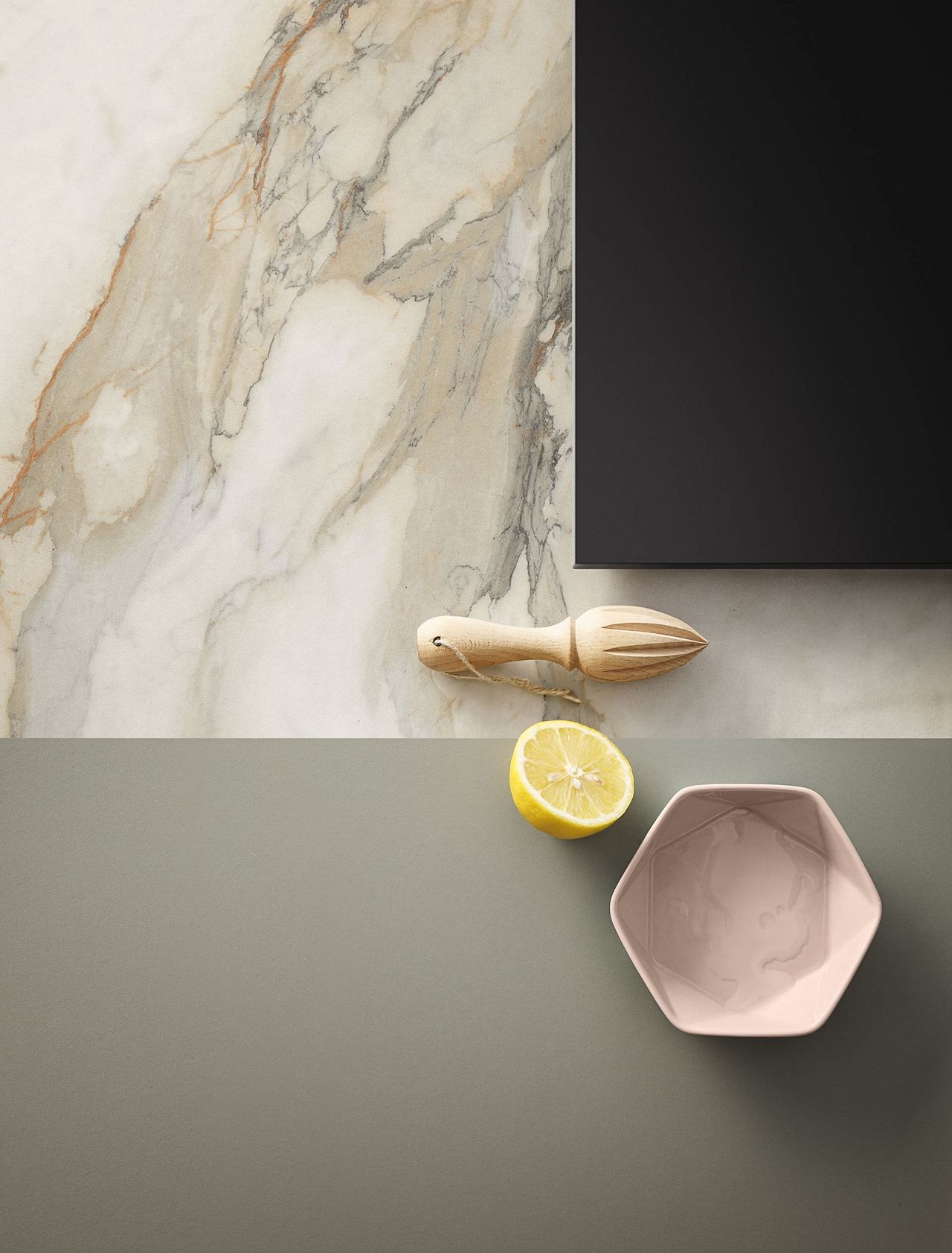
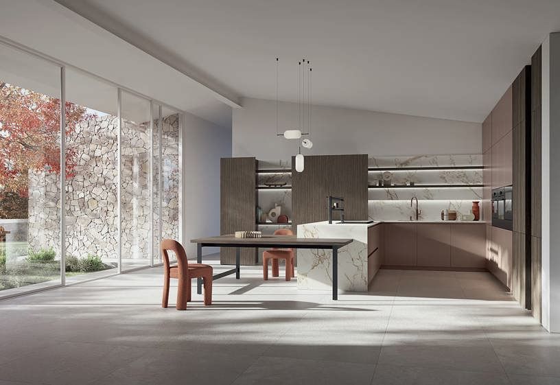
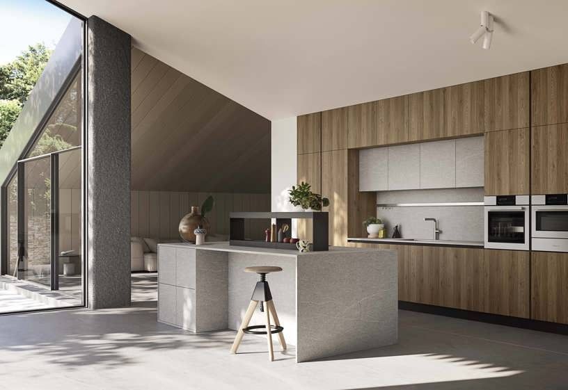
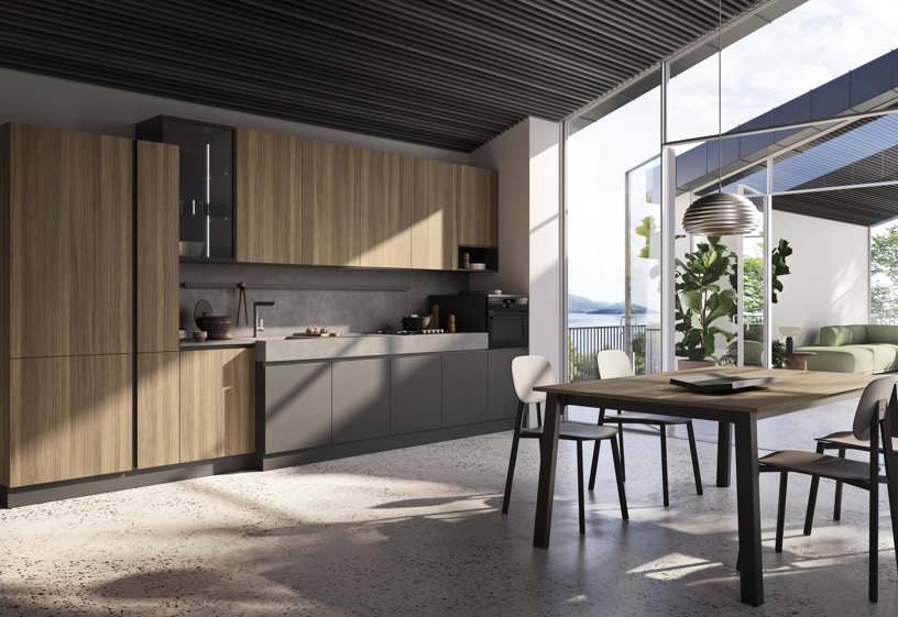
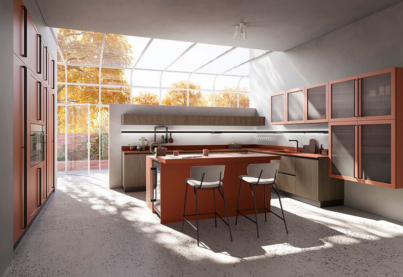
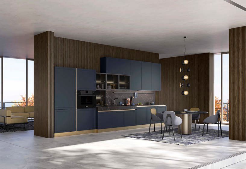
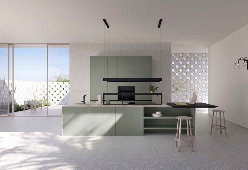
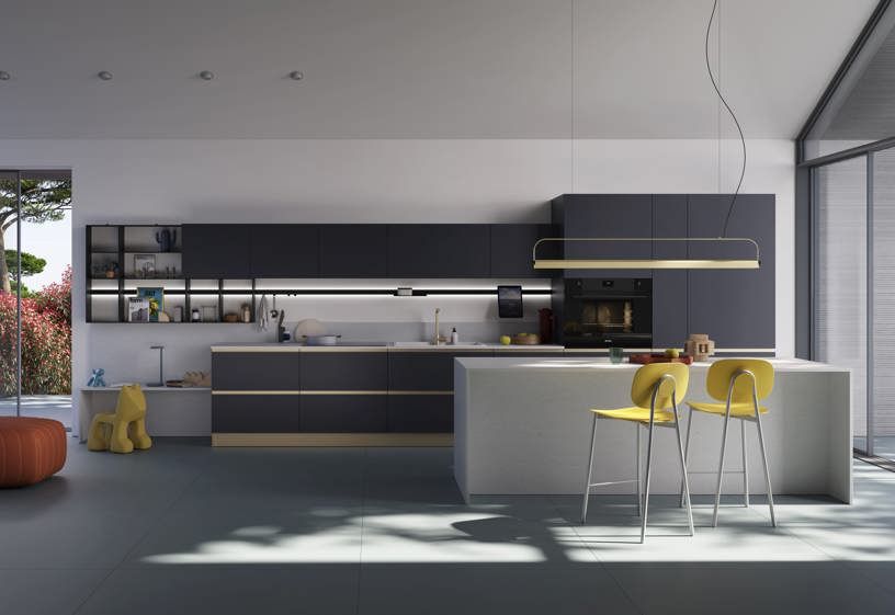
Knowing about the individual properties of colours is just the first step. The real secret for a unique look lies in combining colours in the kitchen.
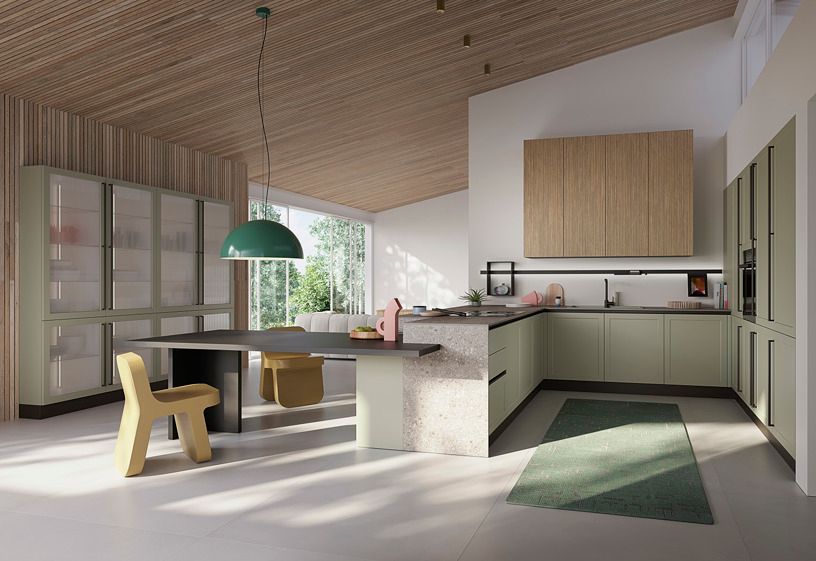
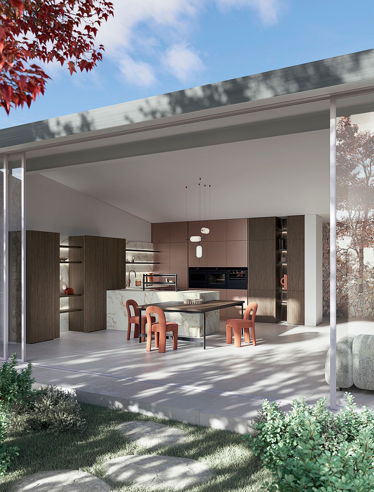
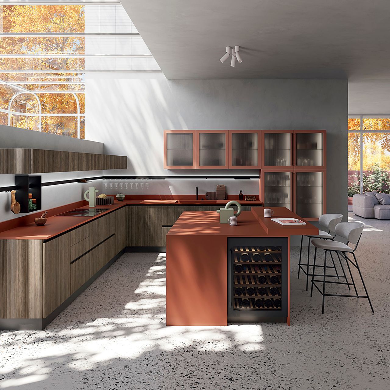
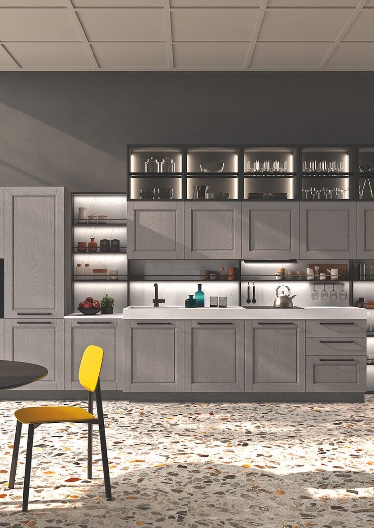
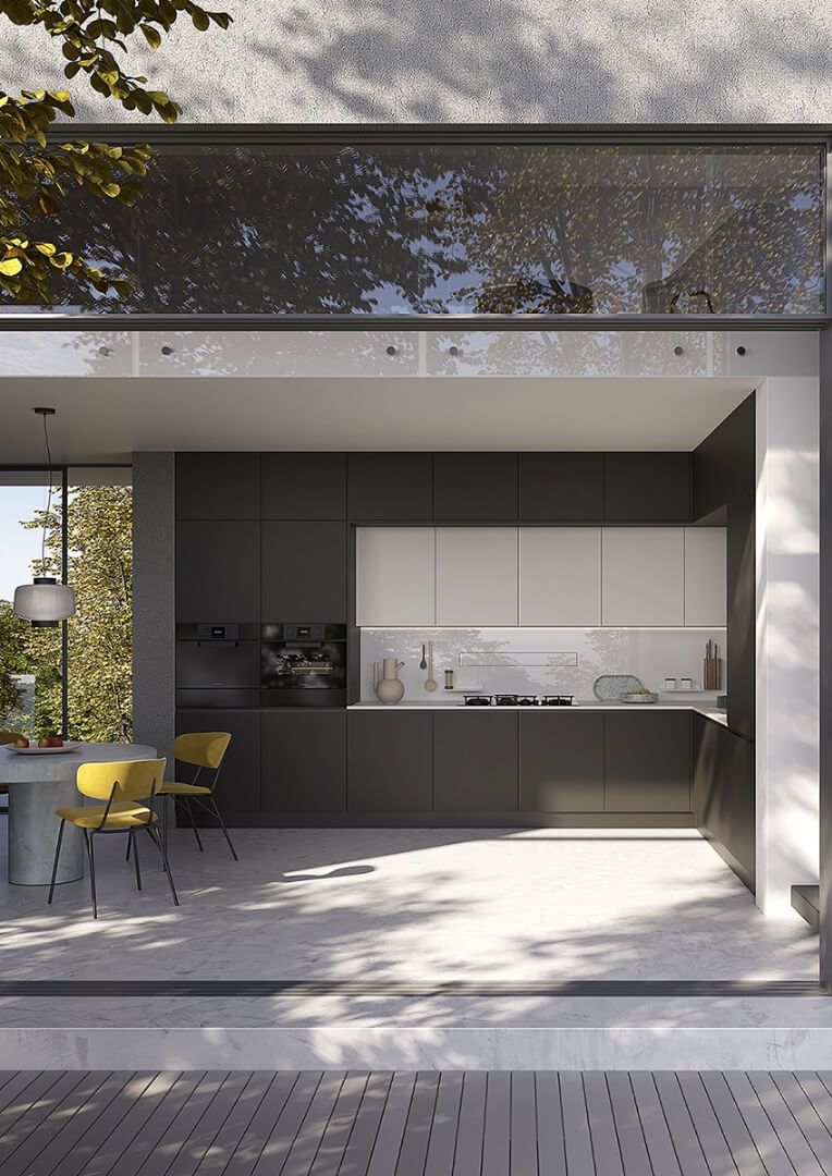
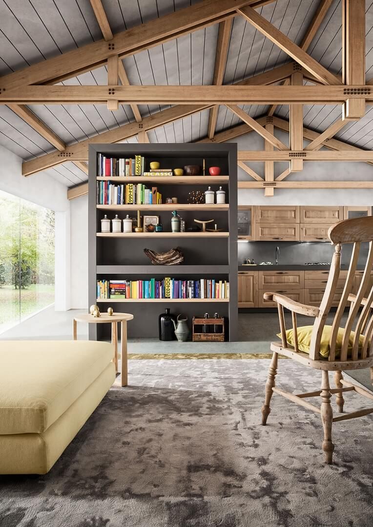
The fundamental principle of combining colours in the kitchen is based in the colour wheel and harmonious combinations of the various colours. The complementary colours — which we find on the opposite side of the wheel — create lively, dynamic contrasts. A kitchen with contrasting colours may, for example, feature navy blue with yellow details, or sage green with touches of brick red. These bold combinations require equilibrium. The secret is to use one dominant colour and another as an accent, as we have already mentioned when talking about tips and ideas for furnishing an original kitchen.
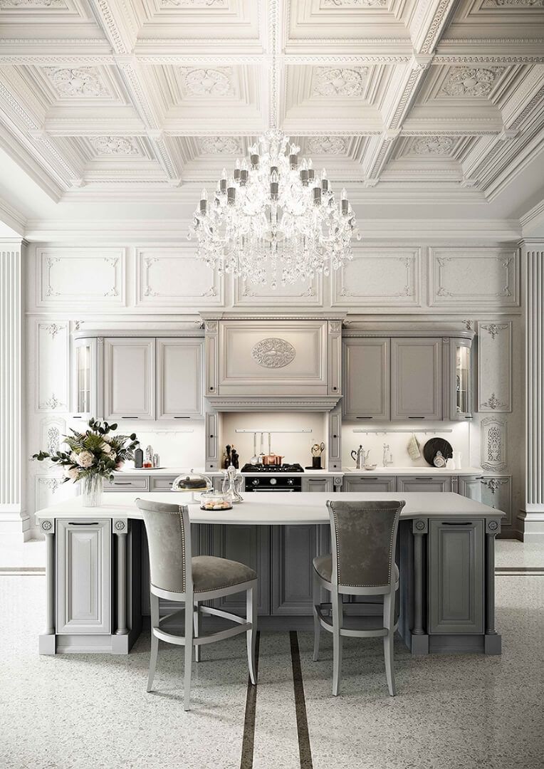
The perception of colour in space goes beyond mere aesthetics. The choice of colour can even alter perception of the size of your kitchen. Cool, light colours tend to make rooms appear larger and brighter, while warm, dark colours make them appear more cosy and intimate. A room with low ceilings will benefit from light colours on the ceiling to create an impression of height, while warm coloured walls can make rooms that are too large seem smaller.
If we need to choose the colour for a small kitchen, we’ll will follow the other advice about how to furnish a kitchen, but also think about the strategic use of colour. A monochrome palette with variations of the same colour family creates visual continuity and an optical illusion of space.
If, on the other hand, you are lucky enough to have a large kitchen, you can be bold with more complex colour combinations. Perhaps a combination of three colours of equal distance from each other on the colour wheel, or a similar approach that uses closer colours to create fluid, sophisticated colour transitions.
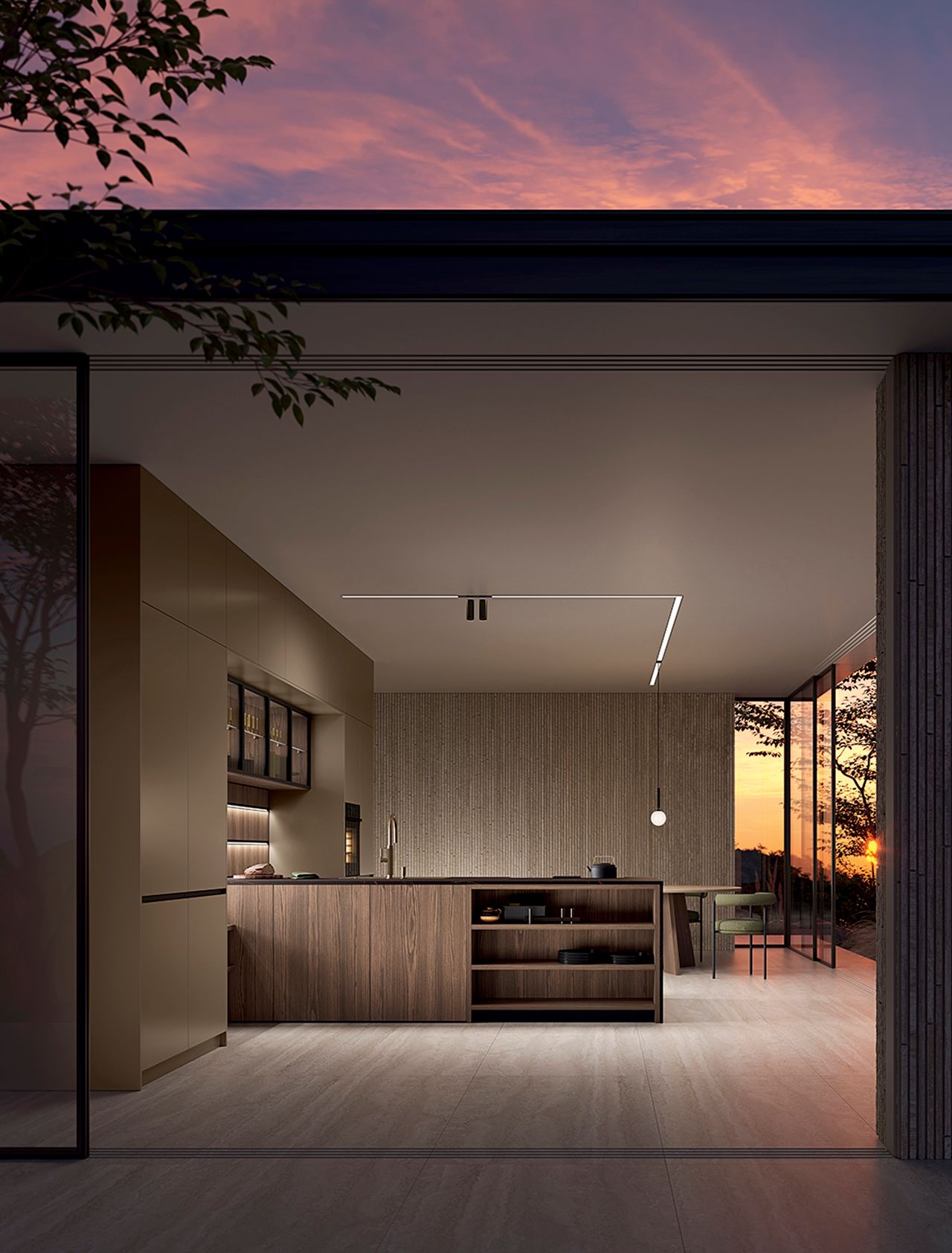
Lighting also plays a key role in colour combinations in the kitchen. A colour can look totally different under natural or artificial light. Before taking any final decisions, always test your colours in various light conditions and at different times of the day in order to be sure that the colour harmony you have created works in every situation.
